LOMA
Role: Creative Direction / UI Designer
OVERVIEW
The LOMA website redesign was created to establish a digital strategy and design language for its insurance platform, bringing the brand forward and telling its story. Throughout the experience, we wanted to focus on simplicity, employee training, development program and convenience. Our goals were to improve the utility to its users, and ultimately increasing user engagement.
LOMA is one of the largest trade associations in the U.S. insurance industry. It offers an employee training and development program used by the majority of American life insurance companies, and by life insurance companies in over 70 countries worldwide.
Problem statement and solution
Based on our user interviews, the biggest problem people have when using the site is finding and purchasing products, especially due to the total amount of content and number of pages on the website. Our solution, which would improve transactional flow and the utility to its users, and ultimately increase user engagement, would include the following business use case needs:
Make it easier for loma.org visitors to understand what LOMA does and what part of that offering could benefit them
Make it easier for loma.org visitors to find and purchase products
Redesign the website look and feel to better align with LOMA’s current brand
Create the feel of a single web property
Reduce the total amount of content and number of pages on the website, simplifying the information architecture and reducing staff effort to maintain the content
Improve the mobile experience using responsive and adaptive techniques
Make it easier for users to do business with LOMA (improved transactional flow and better integration of marketing to transactions).
Make it easier for users to connect the dots between all that LOMA offers.
Make it easier to cross-promote and a broader range of products and services
SKETCHING & WIREFRAMES
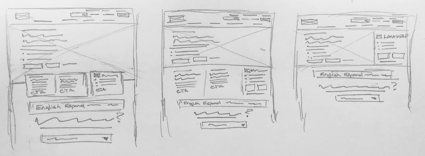
We sketched out home page solutions that would essentially simplify the users experience and ultimately increase user engagement. We divided them into three categories, making it easier for end users to do business with LOMA and know what LOMA is doing. We wanted to make this transaction flow streamlined, build an ongoing relationship with members so they don’t just take “one” course. As they progress through career, they can see what more can be offered.
PROTOTYPE & VISUAL DESIGN
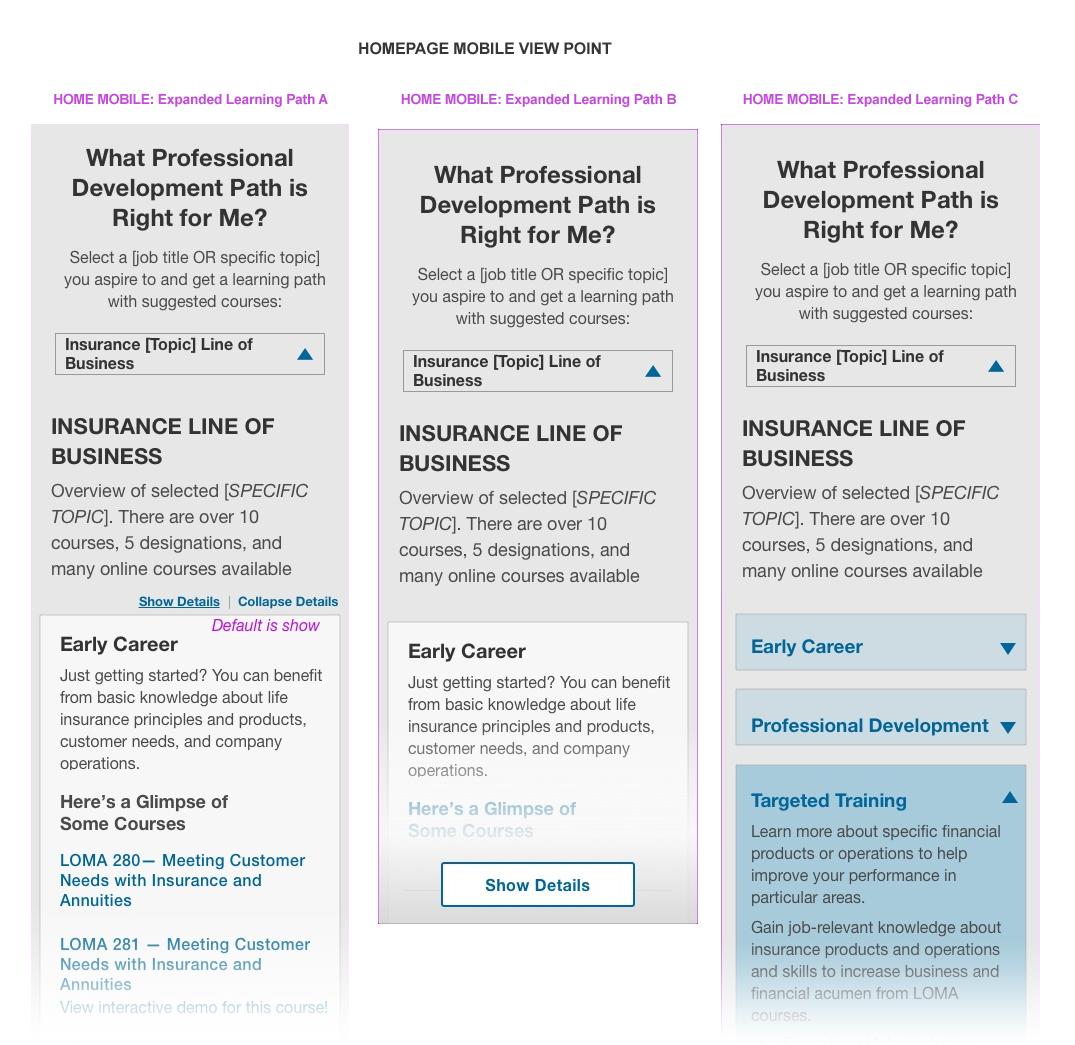
It was now time to define the Visual design and branding guidelines to create the UI elements that would finish up the high fidelity wireframes.


